Homewood Farm - Branding a Legacy
The Challenge: Diversifying a Fifth-Generation family farm
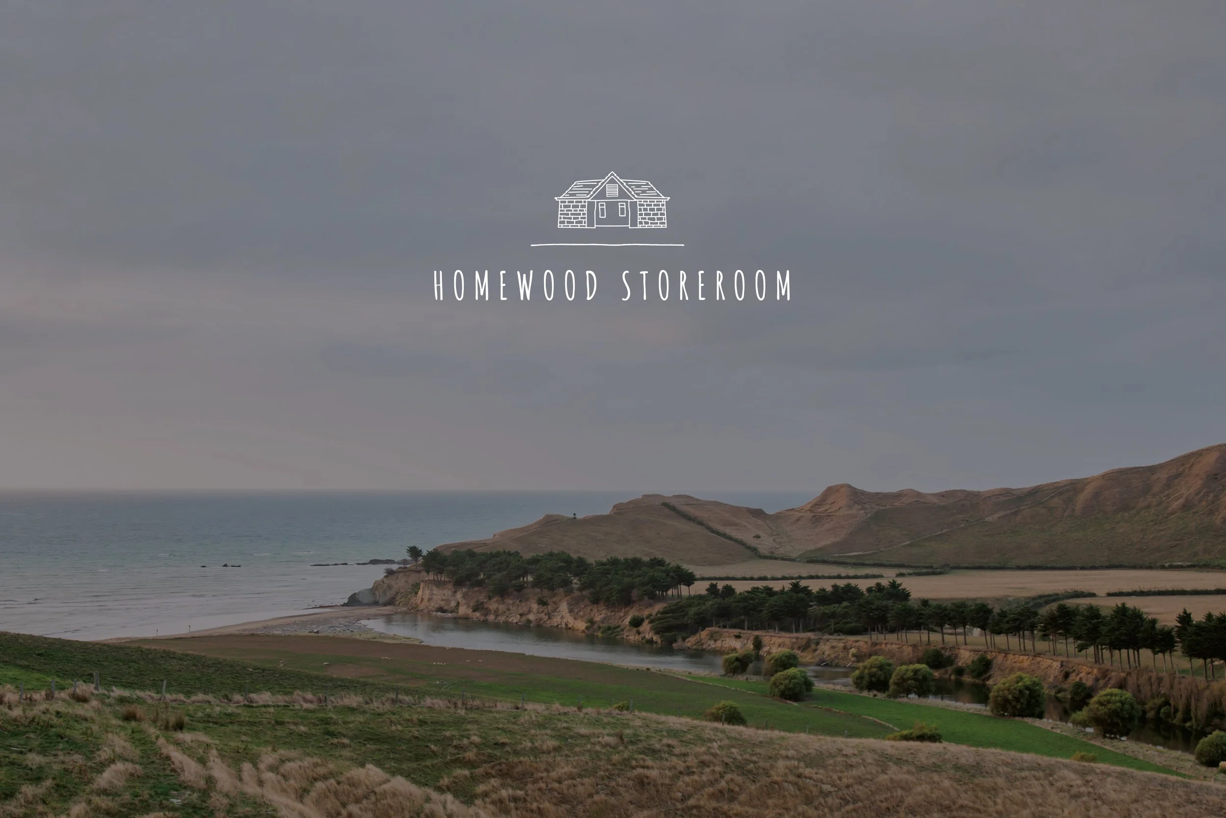
Homewood Farm, a historic sheep and beef station on the stunning Wairarapa Coast, had reached a pivotal moment. With the next generation of sons returning home, each bringing unique talents and skills, the Tatham family sought to diversify their offering beyond traditional farming.
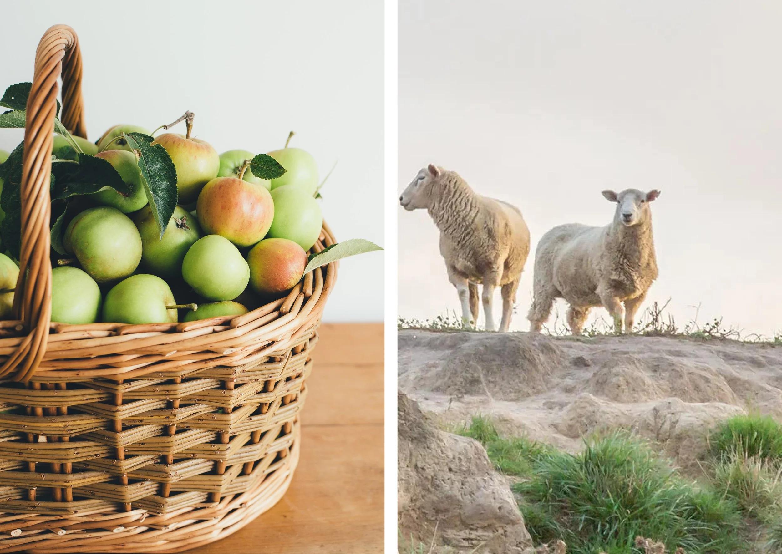
The vision was ambitious: to transform the homestead and buildings into a multifaceted destination, leveraging its existing assets (gorgeous cottages, private beaches, river access) and its farm-grown produce, such as lamb, lavender, nuts, and high-quality Manuka honey. They needed a cohesive brand identity that could tell this story - uniting hospitality, farm-to-table food, and boutique product lines under one authentic umbrella.
Provenance and Authenticity
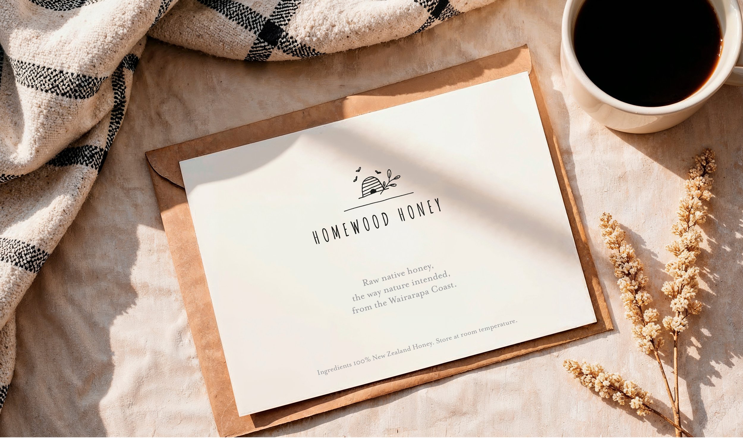
We partnered with the Homewood team from the outset to craft a visual identity that felt authentic, homegrown, and deeply rooted in provenance. The goal was to ensure the brand could simultaneously support the main homestead - the destination - and future experiences and product lines, such as Manuka honey, food products, and a botanical skincare range, while retaining a unified family feel.
Unified Brand Architecture
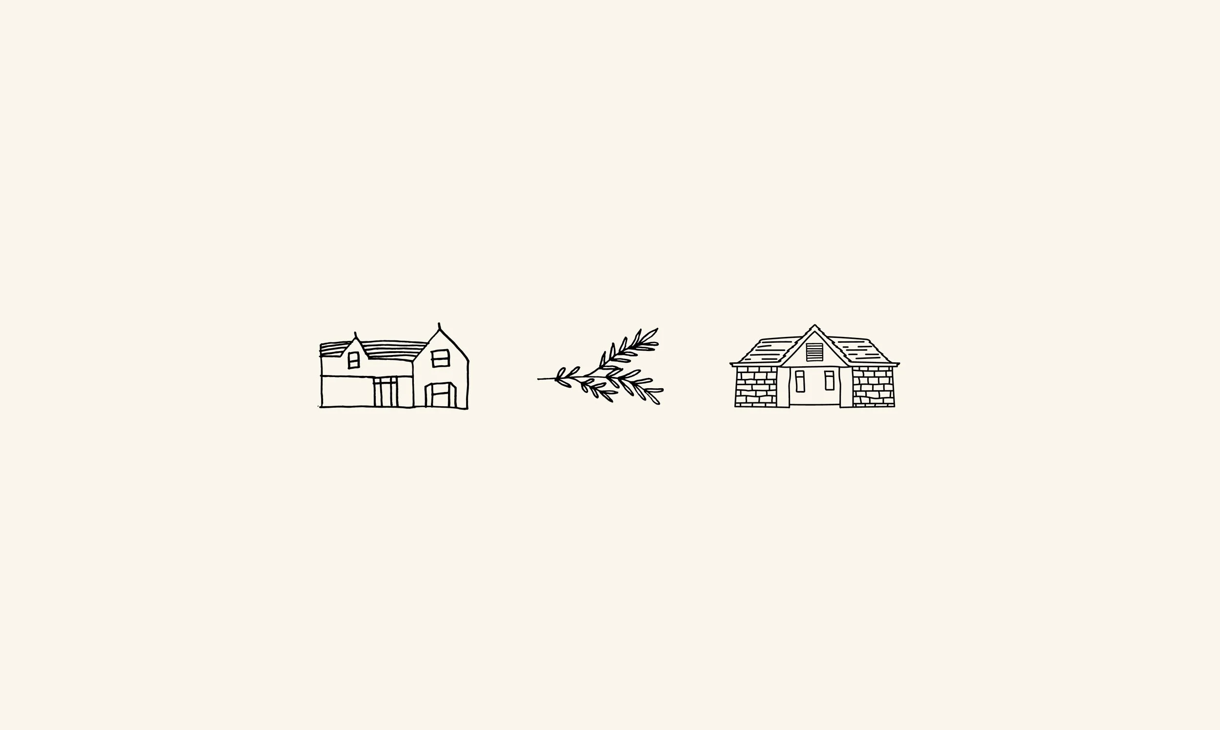
Understanding the vision and potential growth that the Homewood team were keen to undertake, we designed a flexible brand system that allowed for different arms of the business to flourish - Homewood Homestead, Homewood Storeroom (café/shop and products), a range of botanical Skin-care products and Homewood Honey - Each needed to share an everyday ‘farm’ aesthetic while maintaining unique, recognisable marks,
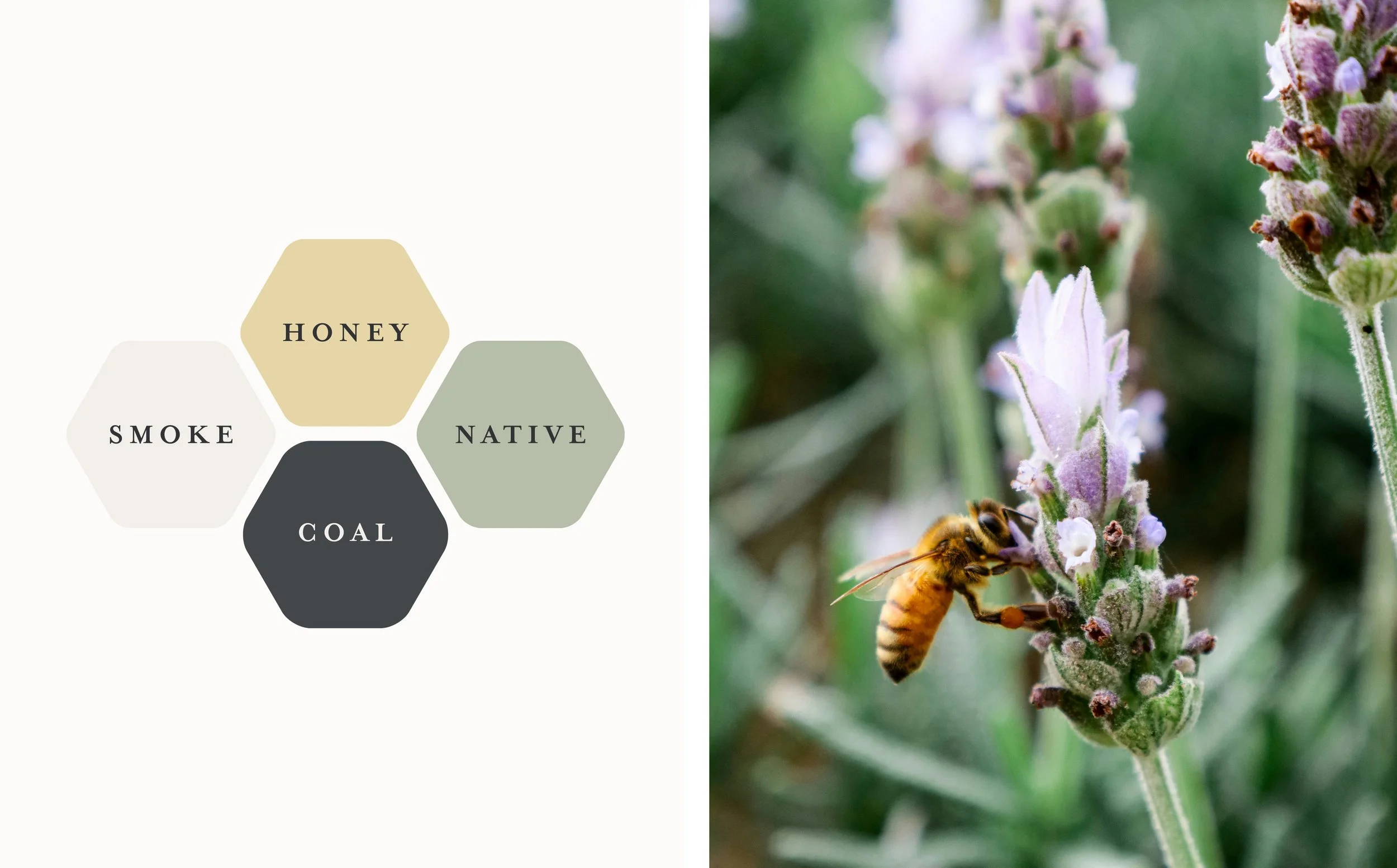
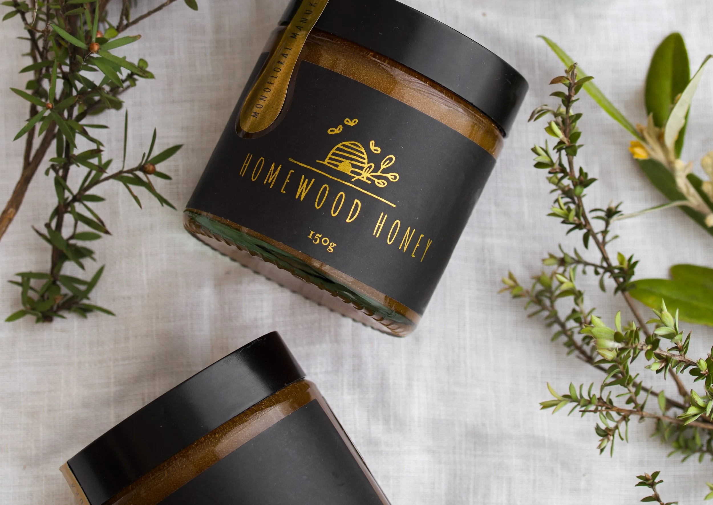
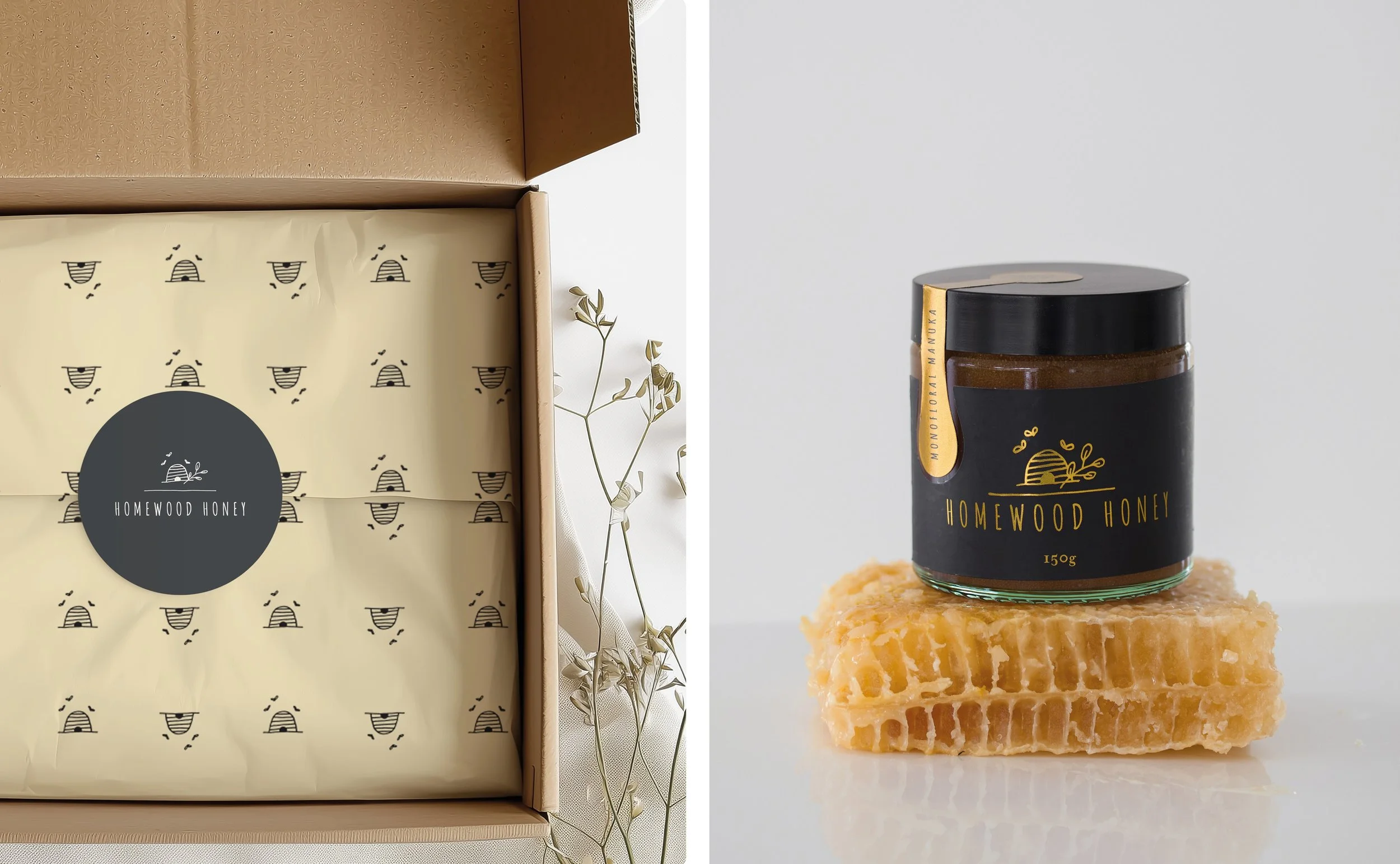
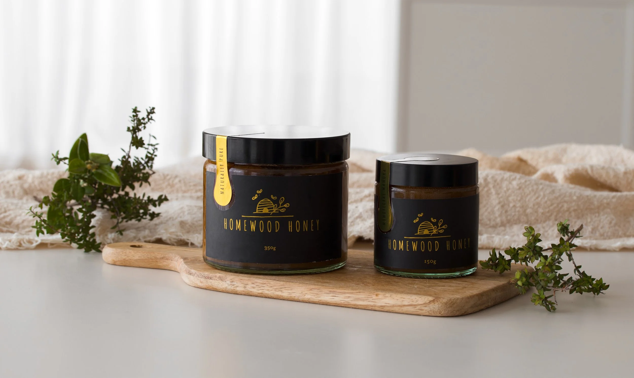
Adding to the brand toolbox, we developed a cohesive colour palette that reflected their unique environment, various pieces of supporting collateral, label design for their Manuka Honey and a set of custom, hand-drawn line illustrations. These simple, authentic illustrations serve as primary logos, subtle patterns, reinforcing the brand's handcrafted nature.

The Result: Creating a Destination
The brand foundations and strategy positioned Homewood as a brand of provenance.
The considered brand identity has helped the Homewood team realise its initial idea into a thriving destination and diversification of the farming operation. The brand identity system has proven it can be applied successfully to the growing list of sub-brands. Homewood Storeroom - cafe and produce shop is now a local drawcard, fulfilling the family's mission to become a community hub and a destination on the map for tourists and summer holidaymakers. A range of Botanical skin products, including ingredients grown on the farm, and of course, their delicious Homewood Honey.
Check out more of their story here on
TVNZ on demand
Hyundai Country Calendar
Sunday 29 Sep 2024 - Season 2024, Episode 31
Keen to talk about how we can help grow your brand?